The Turning Point

As it was felt to be a path too well-trodden and was failing to add anything to the conceptual underpinning of the Agency, the pursuit of a graphic device based on a simplified human form was abandoned.
At its core, TheFulcrum.Agency is about leverage.

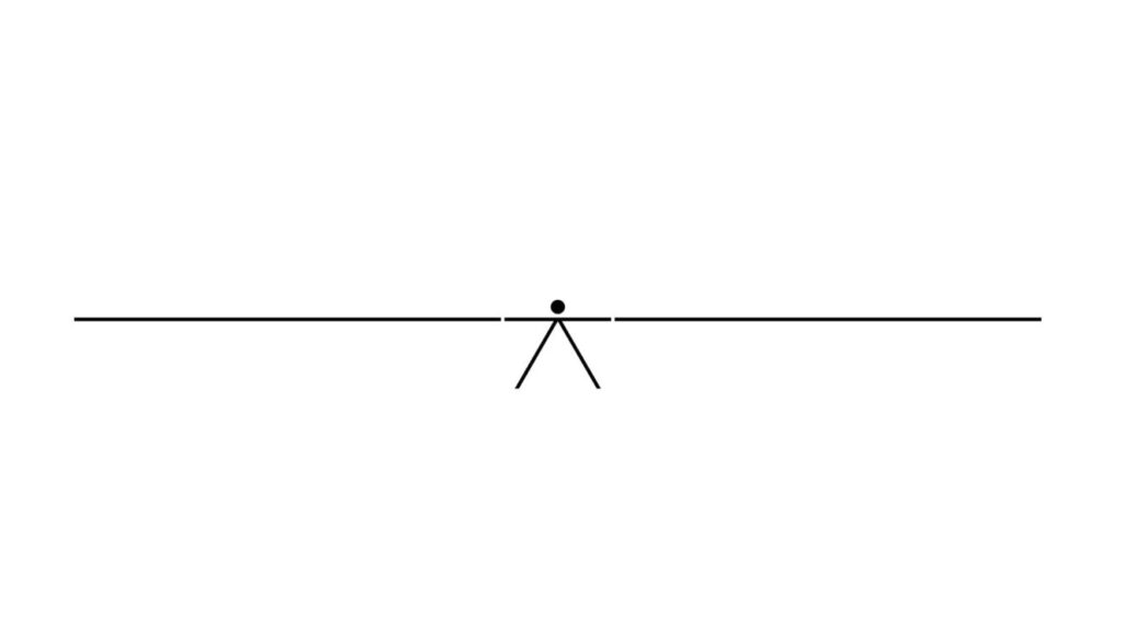
The dot is a natural point (pun intended) around which to explore this idea. It is a point of difference (pun intended) in the structure of the Agency’s name, that was itself derived from the search for a serviceable url.
A dot is representative of a point in space but also becomes a fulcrum when a beam is placed on it. It is also the full stop that indicates that a thought is complete. It provides a pause for contemplation. (period)


Once a heavier visual weight is given to the words on the short side (in this case, the left) of the lever, a minimal ‘force’ can be applied to the right side to visually illustrate the power of leverage.
In our case the ‘weight’ can be the type ‘TheFulcrum’ or a headline or statement. Something that can be metaphorically heavy is elevated with a minimal application of force.

The device can also be used to illustrate competing forces that need to be kept in balance through the planning and design process. In this case, when the ‘V’ representing downward force is placed in the centre, it becomes a ‘V’ for versus. Here, the magic is that no matter how apparently unbalanced in visual weight, the words are, TheFulcrum.Agency is able to hold them in equilibrium.
Rather than attempt to strip the text of all meaning by setting it in a modernist face, the lead was taken from classic editorial design, a practice that has evolved over a millennium to convey content with a sense of authority. The result is a typographic palette that draws not from the vernacular of architectural studio graphics, but from the credibility and humanity of considered journalism.

Similarly, moving away from the starkness of a black and white colour palette, introducing a limited but varied palette of complementary colours, creates a more accessible and ‘human’ look.
Next Article
The Universal. A Place to Start.
(View Article)